CMPT732 Group project NYC CAB Analysis
Speed Analysis
author: Yiwen
1. ETL
- Initial ETL
Please check home page for the intial ETL
This part of ETL is suitable for all four subjects analysis.
-
Speed Subject ETL
-
Trip distance
This is an original data offered by the dataset, I only preserve trip distance greater than 0.
-
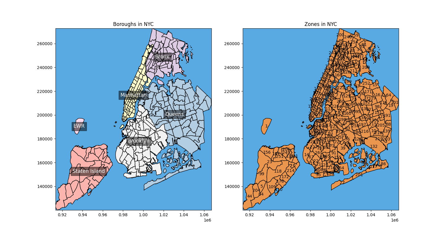
Pickup and Dropoff Zone
The Location ID offered by the original dataset has unknown zone of 264 and 265, I only preserve data with identified pickup and drop off location.
-
Duration
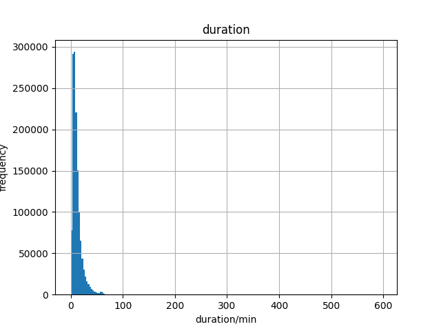
The duration column is generated by the pickup and dropoff time difference in seconds. From the histogram of duration’s frequency, a major range of duration between 0 to 100 minutes is observed. The final duration I kept is 180min in case of special long taxi drives.
-
Weekday and Hour
The weekday and hour column are generated by extracting them from the pickup datetime column.
-
Speed
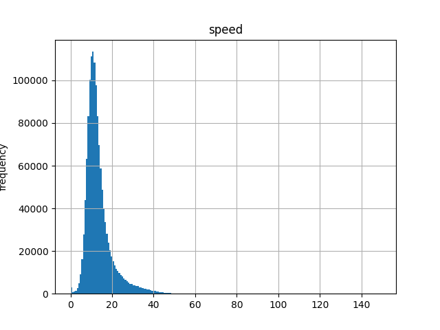
The speed column is generated by trip distance( in kilometer) divides duration( in hour). From the histogram of speed’s frequency, a major range of speed between 0 and 60km/h is observed. The speed limit in nyc is 55mph, which is approximately 88.51km/h. The final speed I kept is 0 to 100km/h.
-
2. What’s the pace of the city?
If we think of a city as a living creature, and roads as veins, then traffics are the blood cells busily running through the veins. By carefully looking at the taxies running record, we can unveil some nature of the dynamic of New York City.
2.1 Rush hours
-
Question: Does different hours of a day and different day of a week affect the speed of the traffics?
-
Perspective: If I am a customer who wants to grab a cab to work, I would probably want to know that how bad the traffic is going to be during the commuting peak hours. If I am a the city manager, I would want to know what are the traffic loads of each hours.
-
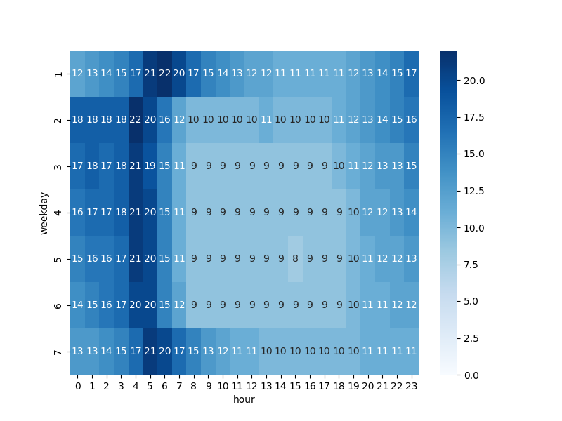
Analysis: I calculate the average speed of all the records in each hour and every day of a week. To see make the map easier to see, I convert all floats number to integers.
- The heatmap below clearly shows a darker out ring and a lighter center square. This means that New York City is most busy from Wednesday to Saturday from 8:00 to 18:00.
- Taxi drivers tend to drive faster at night, especially before dawn, which corresponds to our common sense that most people are sleeping at that time so the roads are less busy.
- There is a pattern of gradient change when we see vertically from Tuesday to Saturday. But Sunday and Monday have a right shift of this pattern, which means a later rush hour and a later speed peak within a day as if the city is postponing its bedtime and then waking up later.
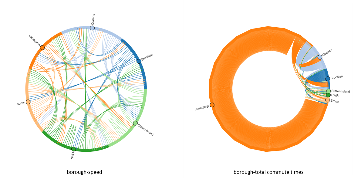
2.2 Zone Speed
-
Question: What is average taxi speed in each borough?
-
perspective: If I am the city manager, I would want to know the traffic load in different parts of the city. If the average speed in one zone is pretty slow, than maybe better traffic planning should be taken into agenda.
-
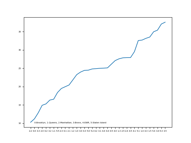
Analysis: I firstly calculate the total amount of taxi record from one borough to another, and then calculate the average speed between each borough.
The original dataset split New York City into 6 zones, which are the traditional 5 boroughs plus the New Wark Library International Airport (EWR). I draw chord diagrams of both average speed and total commute times. From the total commute times diagram, we can easily see that taxi trips mostly occur within Manhattan city, which reasonably corresponds to the lowest average speed within Manhattan. The flow of Brooklyn and Queens also stand out in the chord diagram, which corresponds to the second and seventh slowest average speed within the borough. The city manager would probably want to keep an eye on the heavy traffic flow within these boroughs. Staten Island, on the other hand, is relatively a great place to travel from and to, it is involved in 4 of 5 top average speeds.
-
Question: How about each zone? What is the average speed within each zone?
-
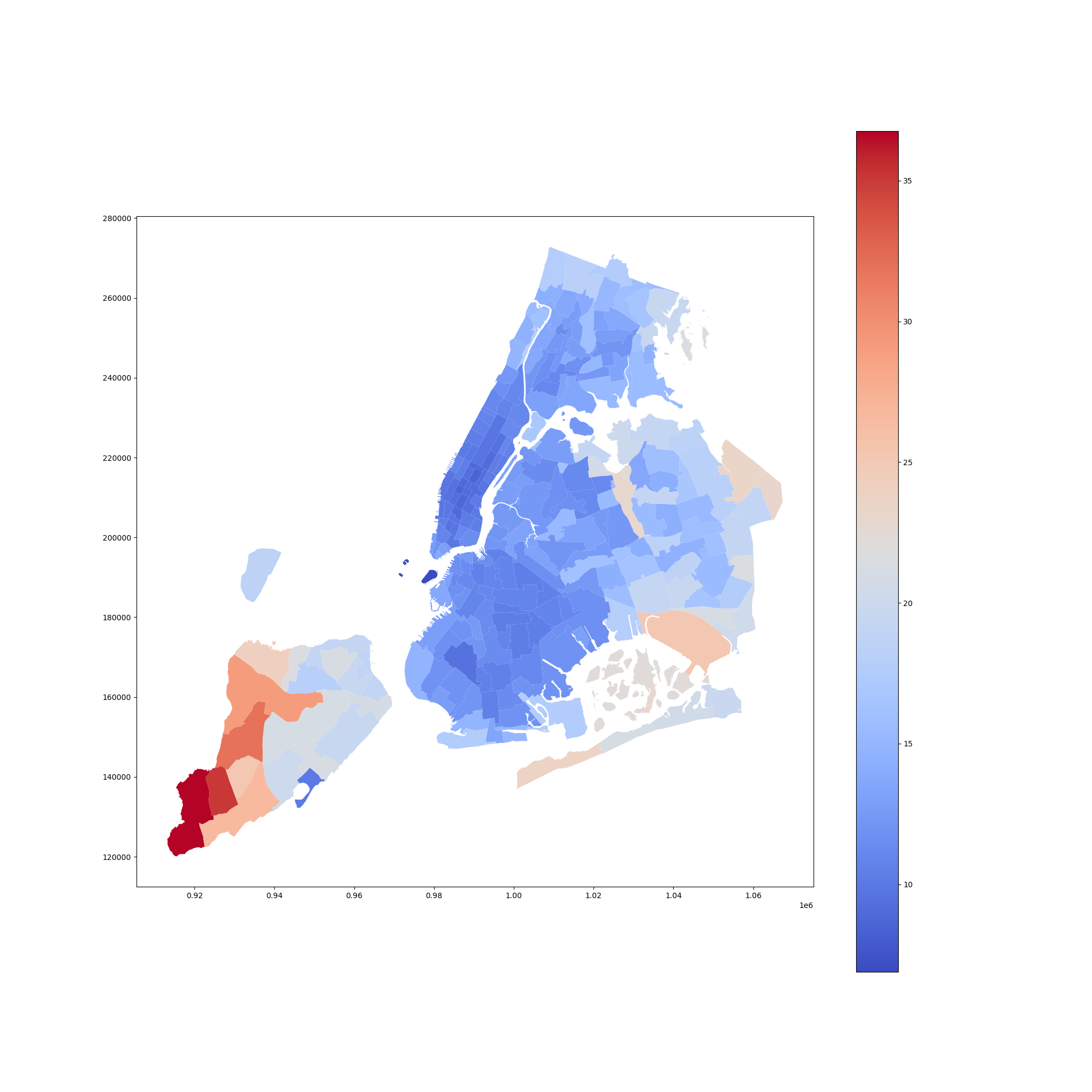
Analysis: The original dataset furtherly split New York City into 263 known zones. I calculate the average speed within each zone and generate a heatmap of speed.
From map below, it is easily to see that the whole Manhattan is in dark blue color, which indicates low speed. And central Brooklyn and central Queens are also relatively dark in blue. The Borough Park (zone 26) zone is with the darkest blue color in Brooklyn Borough, although by looking up in Google, the most busy street in Brooklyn does not lies in this zone. The city managers may want to figure out a better traffic management design for this zone. Staten Island, which is away from the busy part of New York City, with its parks and natural spaces, has the highest average speed among the city. Though in a bottom part of it is dark blue, which refers to the whole area of the Great Kill Park, I believe taxies rarely enter this place thus leads to the deviation of average speed from other part of the borough.
2.3 Speed Prediction
- Question: What is the speed when I want to grab a cab from one zone to another?
- Perspective: Though this question may sounds more like a basic function that Uber offer, this prediction is built purely on historical data with no need for expensive real-time information processing. Customers and Taxi drivers could both care much about speed. Customers may be in a hurry, while drivers always want to get more business as possible in a certain amount of time. The traffic condition also affects the mood of both customers and drivers either, if the traffic is bad and there is traffic congestion on the way, it won’t be a very pleasant trip.
- Analysis: To build a regression model which takes at least the pickup, dropoff location, and time as inputs and average speed of the ride as output.
2.3.1 Feature Engineering
Before I really feed something into a model, I want to make sure this information is relevant to speed. The best way to check this is to do the correlation check or draw some scatter plots.
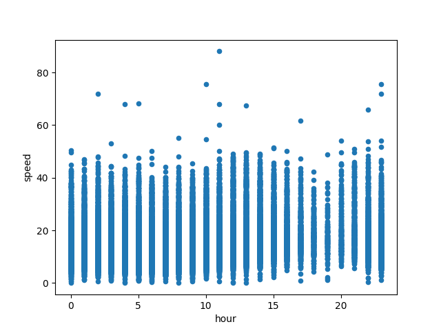
- Time: From the 24/7 heatmap, we can see there is an obvious correlation between the time period and the speed. But here I want to separately check whether the hour and day of the week affect the speed.
-
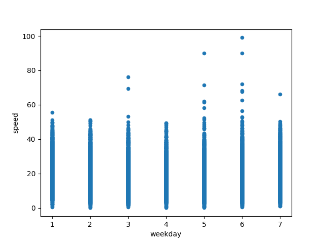
hour: The scatter plot shows a wave-like pattern of dots, this means the range of most taxis’ speed is changing from hour to hour.
-
weekday: The pattern of weekday-speed is not as obvious as hour-speed, this probably means weekday alone doesn’t affect speed that much. But considering the right shift in the heatmap during Saturday and Monday, I think weekday is offering some useful information when predicting speed.
-
-
Location: The location of city is out of question a relevant feature. This is one of the most important information the original data set offer. But we don’t want the Location ID as the feature, because it won’t tell the model the relative position of each zone, instead we get the exact longitude and latitude of each zone.
-
weather: The original dataset does not contain any information about weather, thus I found a data set contained the temperature and precipitation information of 2019 from Kaggle. (https://www.kaggle.com/datasets/alejopaullier/new-york-city-weather-data-2019) I choose the average temperature, rain and snow condition as input features.
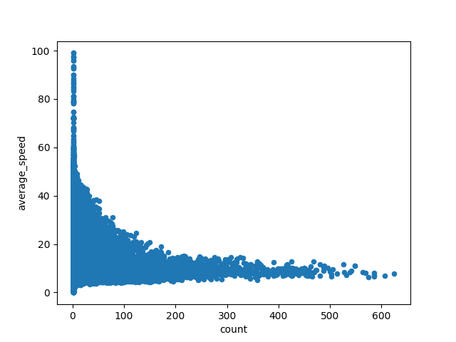
- traffic flow: This is information is also not directly given in the original dataset. But since traffic flow is proportional to the total count taxi drive records from one zone to another in a time period, an feature consist of the traffic flow could be pre-calculated and joined to the original dataset. To think furtherly, the heavier the traffic flow the slower the speed, thus there is a negative linear relationship between traffic flow and average speed. And the Pearson correlation coefficient between traffic flow and speed is -0.21, which proves our intuition.
2.3.2 Model Building
Considering the massive amount of data and limited information to perform prediction, the model used here should have concurrency that speeds up the training process. Besides, the startng model is better if it can give some insights about the feature chosen so that when using other models like neural networks, the right features are used. Here I chose Gradient-Boosted Tree Regression(GBT).
Since only 2019 NYC weather data is available during training, I narrowed it down to only 2019 data. To test whether the feature engineering is good or not, I independently trained the GBT model with only original features, i.e time(weekday, hour) and location(longitude and latitude of pickup and dropoff locations) features, original features with weather features, original features with traffic flow features, and finally all features together. A grid search on a smaller data set for best hyperparameters is performed either.
-
Hyperparameters
Here, max depth of tree and step size needs to be set. This part of model training only uses data of January 2019 and only original features.
-
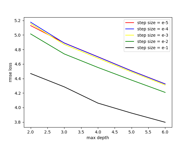
Max Depth
Theoretically, the deeper the tree, the better the performance. But the trade-off between calculation and performance needs to be thought through. Also, the computation capability limitation of a certain machine won’t allow us to train a too-deep model. Thus, the range of max depth is set to 2 to 6.
-
step size
Step size is set to $10^{-5}$ to $10^{-1}$.
A continuous decreasing rmse loss with a larger step size and deeper tree is shown in the under figure. Therefore larger step size and larger max depth needed to be test. With further testing, my computer could not take GBT with no deeper than 8, and GBT model with step size 0.4 has the lowest rmse loss of 3.5698 and r2 loss of 0.6867. Then I only test other model with step size 0.4 and max depth 8.
-
-
With Weather Feature
When using original features plus temperature and precipitation information the GBT model has slight improvements in performance. The comparison between the without-weather model and this model is shown in the below table. GBT gives average temperature about $4\%$ of importance among other features, but the precipitation boolean feature has nearly no importance. For this model, maybe a precise precipitation value is more suitable here.
without weather GBT model with weather GBT model r2 0.7053 0.7134 rmse 3.4256 3.3974 without weather GBT model with weather GBT model hour 0.0580 0.0551 weekday 0.1801 0.1763 pickup longitude/latitude 0.2753 / 0.1407 0.2499 / 0.1356 dropoff longitude/latitude 0.1986 / 0.1472 0.1825 / 0.1498 average temperature N/A 0.0475 has_rain N/A 0.0011 has_snow N/A 0.0020 -
With Traffic Flow Feature
Though as per previous analysis, traffic flow directly affects the speed of taxi drives, the GBT model with the traffic flow feature performs slightly worse than the original model. GBT model gives the traffic flow feature nearly $10\%$ of importance. This may be due to the lack of data samples because when I trained the model again with more data, its loss decreases. There is no good reason to believe the traffic flow feature is a bad feature in this case.
| without traffic flow GBT model | with traffic flow GBT model | |
|---|---|---|
| r2 | 0.7053 | 0.6951 |
| rmse | 3.4256 | 3.5175 |
| without weather GBT model | with weather GBT model | |
|---|---|---|
| hour | 0.0580 | 0.0463 |
| weekday | 0.1801 | 0.1321 |
| pickup longitude/ latitude | 0.2753 / 0.1407 | 0.2888 / 0.1224 |
| dropoff longitude/latitude | 0.1986 / 0.1472 | 0.1909 / 0.1287 |
| traffic flow | N/A | 0.0909 |
-
With all features and bigger dataset
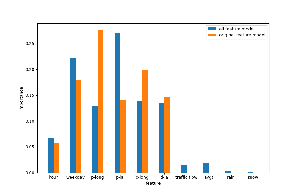
With the previous features and trained the GBT model of a whole year of data, the GBT model performance does not have much change, with 0.6937 r2 loss and 3.1533 rmse loss. This means to train the model, not so much data are needed, randomly sampling data from the dataset may be enough. The feature importance is shown below. With a larger dataset, the GBT model drastically decreases the importance of pickup longitude and dropoff longitude and increases the pickup latitude. Traffic flow and the average temperature are also with less importance. A new direction feature maybe helpful considering the different importance of longitude and latitude. The model largely relies on the location information to predict speed, though other useful information is fed. Maybe a more expressive model like neural network should be used here.
3. Conclusion
- NYC taxis drive at different speeds at different hours on different days of a week. The busiest hours are Wednesday to Saturday from 8:00 to 18:00. Rush hours happened an hour later on Sunday and Monday.
- NYC taxis drive slowest in Manhattan city or travel to/ from Manhattan city, while Staten Island maintained a high average speed within.
- Though Queens and Brooklyn are not as busy as Manhattan, some central area with not so much traffic flow has rather low average speed.
- With location, time, weather, and historical traffic conditions, the average speed can be predicted by the GBT regression model with approximately 0.7 r2 loss.